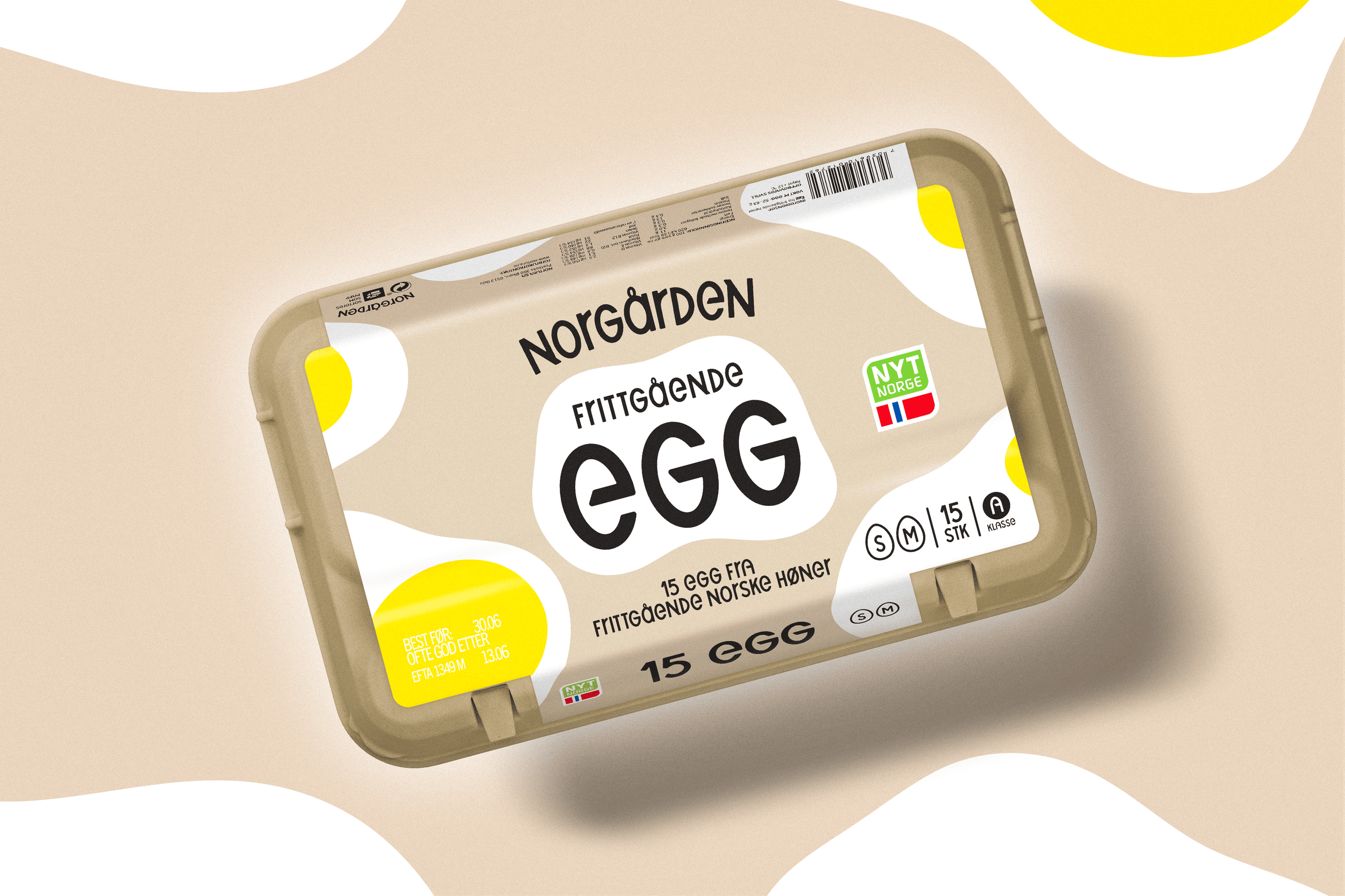
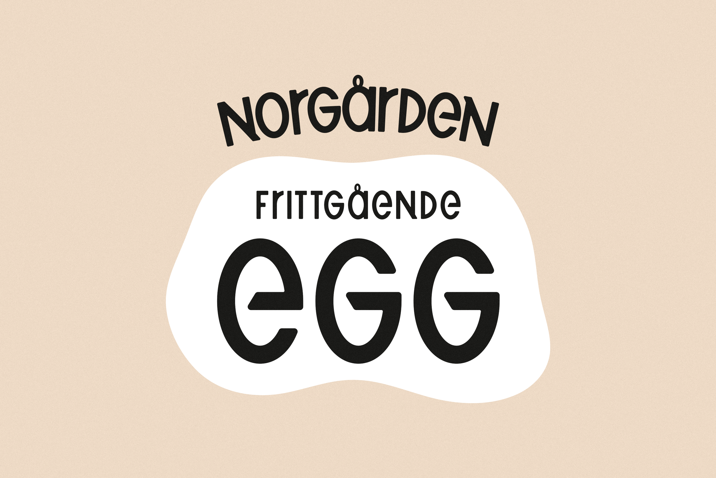
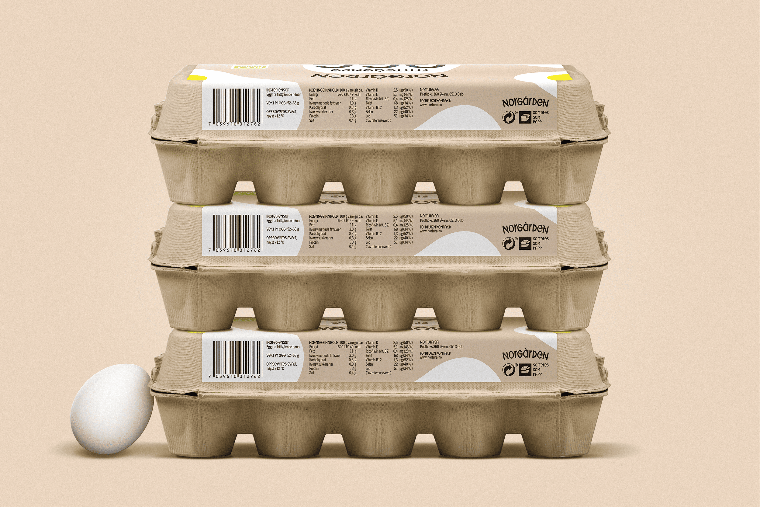
Norgården Egg
To make a great omelett design, you need to crack a few eggs.
2025 | LOGO DESIGN, TYPE DESIGN, Packaging
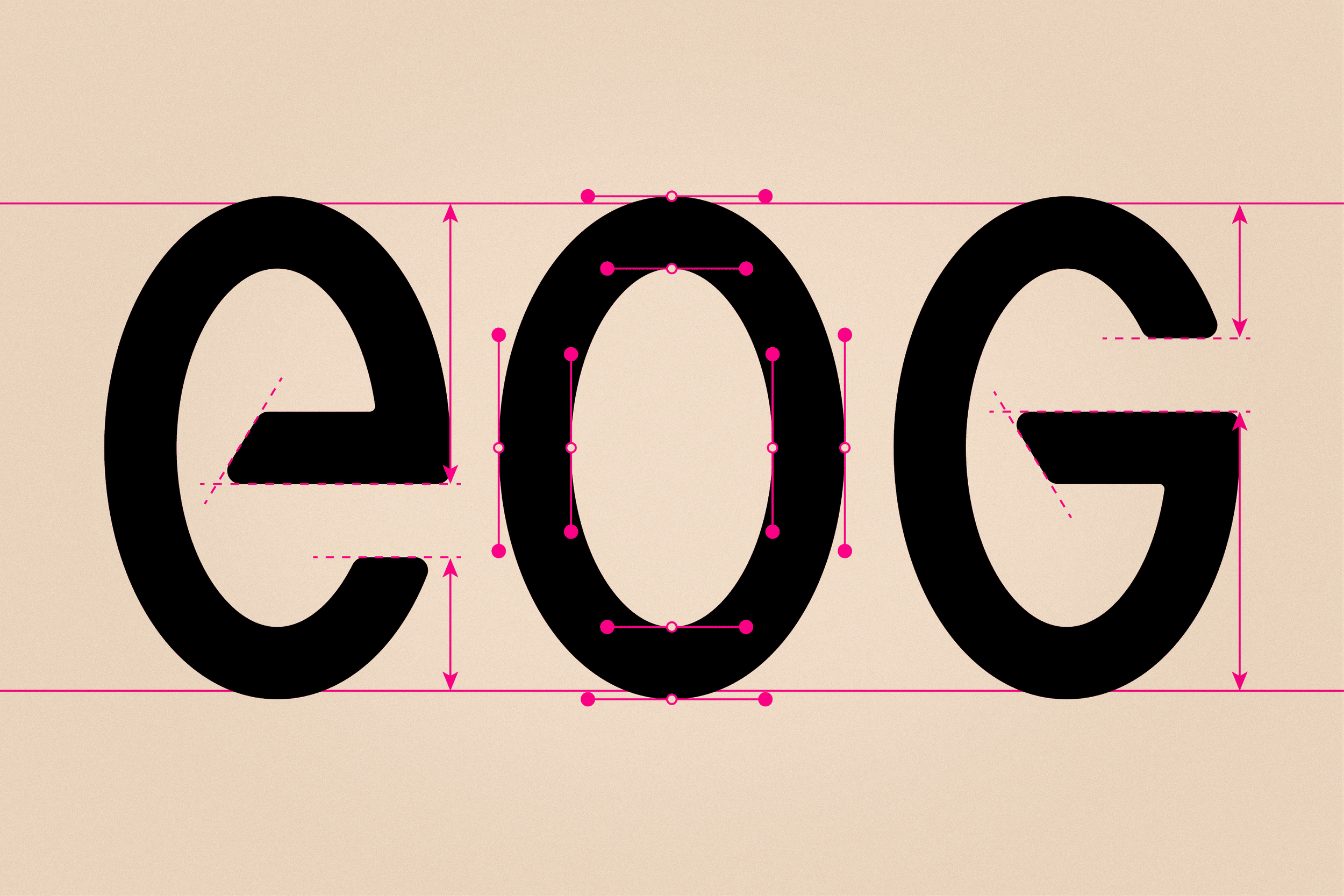
As a new entry into the egg market, Norgården was in need of a distinct look. Taking inspiration from the oval shape of an egg, a custom typeface was created to create a fun and unique style that complimented the ever-so-slightly abstract and simple illustrations of cracked eggs that adorned the package.
A restrained color palette, bold type, and simple composition form a bold and fun design that immediately makes itself known on any store shelf.